


A Greek-script typeface design
Yazıcıgil’s latest project, Pergamon, is a typeface using the Greek script. His book, Pergamon: A Greek Script Typeface Design, published by YEM, tells the story of documenting the rich lettering heritage of the ancient city near Bergama, in İzmir province — a Hellenistic capital and Roman metropolis — and reviving it as a Greek-script typeface for digital use.
How did the idea for Pergamon emerge, and how did the project develop?
I took a research sabbatical from Sabancı University in the autumn of 2022. Quite separately, I had always wanted to revive a historical writing system. The main reason is that bringing an old script, or a sequence of forms, into a contemporary context requires several production processes, and I learn a great deal from them and enjoy them enormously.
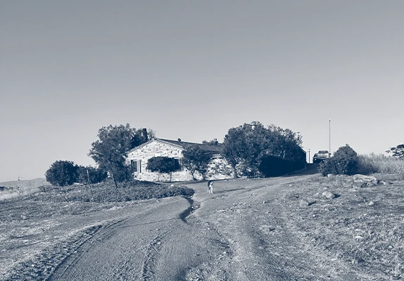
Around then, I learned about Gate 27’s artist residency in Ayvalık. Bergama is a 45-minute drive away, which encouraged me to begin the project there.
What does giving letters created 2,200 years ago a contemporary function mean for design culture?
It would actually be more accurate to say 1,900 years. For me, projects like this reinforce the idea that the underlying purpose of any visual communication tool, from cuneiform to variable fonts, can keep evolving, regardless of the medium. It also reminds me to think of time not simply as a linear concept, but as something moving along an axis.
Could you describe the design process? What did you consider when adapting these Greek letters from Pergamon, a city mentioned in a work dating to 399 BC, for today’s digital environment?
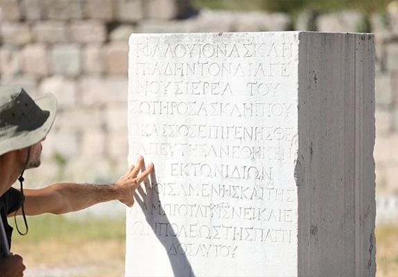
Although Pergamon first appears in the historical record in 399 BC, few inscriptions survive from the Hellenistic period. Most of those there now date from the Roman imperial period, particularly AD 100–200. So the forms I could study and draw inspiration from were the epigraphic finds from that period.
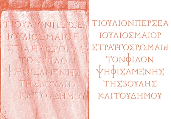
I began by photographing the letters from the same angle at the same time of day. Although I was familiar with modern Greek lettering, the ancient Pergamon inscriptions contained interpretations of certain letters I had never seen. My close friend Paris Tsekouras helped identify some of them. That allowed me to recognise the unfamiliar forms correctly and place them in the appropriate Unicode positions in the font.
After the photographic documentation, I drew the letters digitally as vectors in type-design software. At the final stage, once I had drawn the forms exactly as I saw them, I adjusted their widths and weights to give them a consistent rhythm together.


What do these letters tell us about their time? And what will your new typeface, developed from them, say about ours?
They speak very loudly about how the visual culture of imperial Rome influenced the former Hellenistic capital. The inscriptions were conceived almost as visual representatives of Rome. From the anatomy of the letters to the harmony between thick and thin strokes, they reflect Roman epigraphic culture.
They also show how some of the inventive visual solutions used in compositions carved in stone remain relevant to digital typography today.
Drawing on your research and academic work, what can type and design tell us about this region’s visual communication culture?
This is a valuable region, home to many writing systems. Look at Turkey’s neighbours: Bulgaria, Greece, Armenia, Georgia, Iran and Syria all use distinct writing systems or alphabets to represent their languages. Turkey, situated among them, has used Latin letters for 96 years. The international type-design community is increasingly trying to support these countries’ scripts alongside the Latin alphabet.
In Turkey, however, a design culture focused solely on the Latin alphabet still dominates. Look at Istanbul before the alphabet reform and you find original type designs in dozens of writing systems. It is very hopeful to see some of my emerging students beginning to design typefaces for other scripts from this region.
What effect has that Latin-centred design culture had on Turkey’s cultural and visual design heritage? Alongside the gains of a reform shaped by complex aims, strategies and plans, do you think there has been a loss in written communication, language and design culture?
I think a visual design culture centred on the Latin alphabet inevitably offers a limited spectrum and, with a few exceptions, the typographic range amounts to a series of pastiches. At least, that is where I think Turkey has arrived.
The alphabet reform’s gain, to me, was written communication better suited to the language’s phonemic structure. Its greatest loss was the neglect of vocabulary essential to particular forms of expression during what was called the simplification of the language.
How do culture, writing systems and typefaces influence each other? Does one dominate, or is it an exchange? What do we see of a place’s culture in Helvetica, for instance, or in typefaces designed elsewhere?
The various modernist movements that shaped European visual culture, particularly in the 20th century, produced established typefaces that were, to some extent, representatives of those movements.
Later, the aggressive marketing demanded by capitalism’s rapid expansion in postwar America drew on that visual heritage. It determined the eventual uses of typefaces originally conceived in a modernist spirit, from toothpaste to car advertising.
In other words, writing systems may begin by representing particular visual codes, but they can break free of that initial relationship and continue in new contexts — or quietly disappear.
How do changing cultures find their way into type? We might also talk about other visual forms of expression, such as GIFs and emoji. Even if they do not become part of writing systems, could they limit linguistic expression? Or should we see them as another kind of visual richness?
I don’t see much that is permanent around me, and it doesn’t trouble me: it is also a reminder of the value of memory. Certain visual approaches dominate type design at the moment. Exaggeration is being used generously again, for example, and microscopic notches and projections originally devised for optical correction have reappeared, regardless of their practical function.
As for emoji and GIFs, emoji are symbols with Unicode values, just like letters and punctuation, incorporated into fonts. Symbols have always been used. Sometimes they are very effective where long strings of words fall short, like the symbols I mentioned at Pergamon.
You mentioned students beginning to design typefaces for other writing systems from this region. Could you share some examples?
İbrahim Kaçtıoğlu is one of the first. After completing his master’s at Sabancı University with me, he went to ESAD Type in Amiens, France, for further postgraduate study. Last month, he graduated with Wierd, an experimental typeface supporting Latin and Arabic scripts.
He made a project that does justice to ‘experimental’, a term whose meaning has been distorted. In typography, unfortunately, it has come to mean a random, uncontrolled series of trials and errors. İbrahim instead created unexpected relationships between thick and thin strokes in an extraordinarily controlled system: a typeface that can be read and also demands to be looked at.
Creating balanced harmony between the contrasting Latin and Arabic scripts is difficult. As its name suggests, it also offers a legible experience at very small sizes. In short, he made an experimental design that becomes strange when enlarged but readable when reduced. Related link
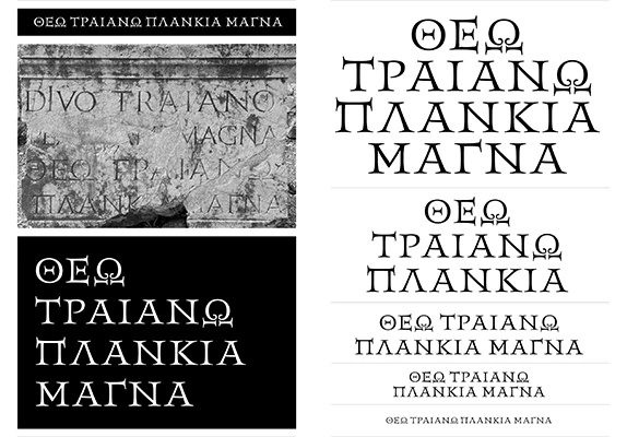
I’m also working with two master’s students at Sabancı, Ruslan Abasov and Bartu Başaran. They are studying Greek inscriptions at the ancient city of Perge in Antalya.
After my Pergamon project, Istanbul University’s classical archaeology department invited me to stay at the excavation house at Perge. I spent three days documenting Greek and Latin inscriptions. Inspired by Pergamon, I imagined a Perge typeface, possibly supporting both scripts. I then proposed the design as a project for Ruslan and Bartu in the course they were taking with me. Ruslan chose Latin letters, Bartu Greek. They are digitally reviving the inscriptions as typefaces.
Beyond Perge, Ruslan’s thesis examines an experimental Cyrillic typeface, produced in cast metal type, that he found in a Bulgarian book printed in Istanbul in the 1860s. As part of that study, he is designing a typeface with Cyrillic and Latin scripts. Bartu is studying Greek and Latin typefaces found in books printed with cast type in the 16th century, reinterpreting them for a contemporary project. Naturally, these projects excite me enormously.
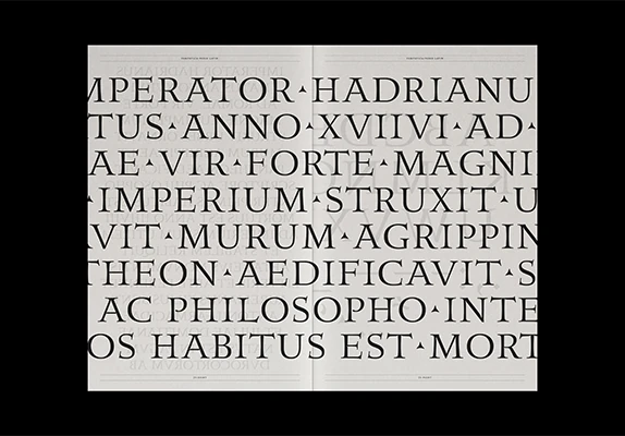
Pergamon: A Greek Script Typeface Design
A related read: Words Trapped in Books, by Damla Kellecioğlu. Related link
Paylaş


